Have you ever thought of getting a precise entry for a trade on 1 Minute chart in order to get the best possible price, even when the trade entry signals may be from any of the higher timeframes? Ever wondered of getting the very top or the bottom of a Monthly reversal point? While it may be impossible to get the absolute top or bottom of a monthly reversal, its actually a matter of practice when it comes to zooming in on price action for better entry, even all the way down to the M1 timeframe.
The best way to do this is with an example. So I thought of breaking it down on the most volatile instrument – EURUSD. You will be amazed at how many trading opportunities one instrument can provide during a trading day.
Lets start with the monthly. As they say, picture speaks a thousand words…

This is our bare bone monthly chart. This is the starting point for any analysis for me. I like to feed the information from higher timeframe charts to my subconscious mind at the start of a session. It does help me take trades on lower timeframes with confidence.
Here is the same monthly chart with trendlines.

As you would expect the Monthly chart is in a huge channel. The price has just touched the support a few candles back (few monthly candles of course.) The overall monthly chart is in very huge consolidation which means a sideways market.
One could argue that a monthly horizontal support line has been broken to the downside. It may well be the case. But for the purpose of understanding the charts and their fractal nature, its best to work with trendlines only. Then of course, you may choose to use horizontal support, resistance or any indicator for your trading signals.
This technique of zooming in on price is basically a method to get the best possible price and not a strategy of its own.
However, by the end of this post you will hopefully have a light-bulb moment and be amazed at how predictable the market actually is. Its not to say that you will win all your trades from now on, but it gives you power and confidence in pinpointing entry and exit levels. By which you could time your entries or wait for the price to come to a certain level or trendline.
The weekly chart…

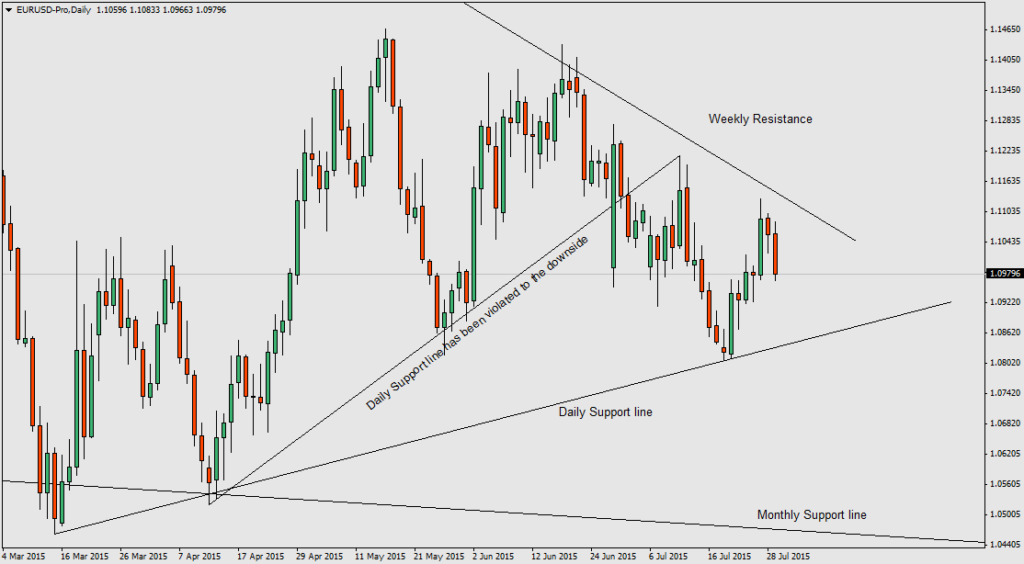
As of now we only have a vague perspective on the market. The EURUSD has been on a very sharp bearish trend and in February 2015 the price has sharply bounced off of monthly support line and yet to break the weekly trendline resistance to the upside. In fact the current candle has just formed a long upper wick, suggesting that the price just tested the trendline but failed to violate it to the upside. But the candle has two more days left before close.

Note the two trendline support lines added in this time frame. Both of them are support lines, although the one in the middle (sub support line) has been violated, and the one in the bottom (main support line) is yet to be violated.
There are few more things to notice here other than the trendlines. The market is in consolidation and constantly moves back and forth. Until it violates either the main daily trendline support or the weekly trendline resistance price will continue to move back and forth.
Having said that the main daily trendline support and weekly trendline resistance have squeezed price in to a possible wedge or triangle shape. So we can expect a breakout in the very near future.

Now, if you followed me from the start, you must be getting a vague idea as per the short term direction bias of the market.
Above snapshot says it all. The price is right in the middle of the weekly resistance and the daily support. But on H4, support has been violated to the downside. It says that the market is bearish, short term.

Now we have few things in support of a short-term bearish market.
- Strong Weekly bearish trend which has not yet violated the trendline support
- Previously broken sub-trendline on the daily timeframe
- H4 trendline support has been violated to the downside

Now to the H1. Do you see the nice price channel on the hourly chart? Price is exactly on the support line. But evidently there is some strong rejection off the trendline. Previous two candles had had very strong bearish momentum (due to an important NEWS event.) Regardless, price does not seem to like being below the support line. Next hourly close would reveal a clear picture, of course.

Now we are down to the M15. Price has broken out downwards from an M15 channel too. But look at the momentum that price broke out of the channel. More importantly observe where the breakout candle stopped and the next pinbar candle formed showing strong price rejection – its the hourly channel support.

As promised, here is the last piece of the jigsaw. Price actually is in the process of creating a nice wedge shaped channel. The last M1 candle seemed to have broken out of the wedge like pattern. But as of right now, price is dancing around the hourly channel support.
the market is at a significant price level. There are numerous possibilities. Personally I would wait to see a convincing breakout of the hourly channel support and go short on pullback to test the same support line and zoom into lower timeframes for a better entry.
One thing for sure, if I ever get that trade opportunity, I will take it with confidence, without a hesitation whatsoever. It does not matter if the trade becomes a winner or a loser. I won’t have to second guess the market, because of the sound multi-timeframe analysis that I had already done and the broad market perspective gained from it.


